Auderli: A New Personal Finances Startup
Auderli is a startup that focuses on personal finances. The app provides users with a secure space to organize and share important life information.
My role
As the designer on the team, I joined at the very beginning. I worked closely with a CTO, engineers, and a Product Owner. Together, our goal was to design and build the app from the ground up. We focused on delivering a top tier UX using lean/agile, releasing an MVP early and releasing updates regularly, learning as much as we could along the way.
Understanding and Mapping the Founder’s Vision
Our founder, who is both an accountant and an entrepreneur, had a clear vision for a product that addresses specific needs he has observed while working with people’s personal finances. By understanding this vision and mapping it out at a high level, as well as identifying key user profiles, we were able to begin with the end goal in mind. This was our North Star. Having this allowed me to regulatry take a step back and gain a broader perspective before diving into the details of individual stories.

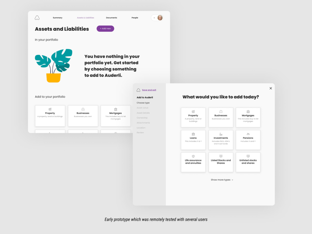
Early prototypes
The app has some basic features that are used repeatedly to create a consistent and cohesive user experience. I created e app and tested it regularly prototypes of the app to test with potential customers to make sure the user experience was on the right track. This testing also helped us confirm some of our early assumptions and statements from the founders.
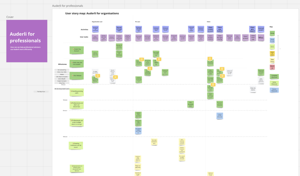
Working with story maps
Through trial and error we discovered that using story maps was helpful in dealing with the the large number of user storie. It allowed us to explore various scenarios and, most importantly, helped us simplify and prioritize them into actionable stories.
Starting ‘low-fi’
As someone who strongly believes in receiving feedback early and frequently, all major pieces of work start with low-fidelity sketches and flows. These are shared through Slack/Teams. If they are a bit more complex, I will provide a loom video walkthrough for the team to review and provide feedback at their own pace or discuss in person. For each “feature,” I create a Teams/Slack channel where designs can be shared and discussed.
This approach has helped us iterate quickly on designs and minimize design waste in more exploratory work and h team reelps the team size and prioritise larger areas of work.

Creating high fidelity mockups for the Engineering team to build and estimate
Using Figma and either a file or a page for each user story we were able to use detailed designs to provide estimates for engineering effort. Normally we would discuss and review a design as a team, before estimating the delivery effoty and or breaking it down further. This was central for the teams ability to plan Sprints and deliver features. The designs can include detailed annotated up designs when extra detail os needed over and above the BDD which is created from the designs and used for acceptance testing.


Building a brand, website and design system
We wanted Auderli to have a strong brand which should be approachable, accessible to all and soften the difficult subject of death tech. We worked with a brand agency to help us create the identity and which has then evolved in the app and website.

An early design system
A design system for Auderli has been created using a Figma component library. This initially focussed on basic brand elements. Colour, typography, buttons, form elements and icons and illustrations.
As more complex components have taken shape these have been added and the component library has grown and evolved. The approach is inspired by the Brad Frost approach of beginning with base level Atoms and building combination components out of more basic building blocks.

Documenting design decisions
So often painstaking design decisions can get lost in the passage of time. To help build a solid design foundation I believe that documenting design decisions, design research and creating guides (For example: Writing for interfaces) as we go will help us in the future understand why decisions were made.

Tooling and collabration
My primary design tool was Figma. I created a design system early for atomic elements and built the pattern library slowly as UI patterns became more established. I organise the Figma files by Objectives. For each long term objective I create a design file, and for each individual story a page which is linked to from individual stories. Where neccessary prototypes are included.
| UI Design | Figma |
| Animated elements | Lottiefiles |
| Prototyping | Figma |
| Storymapping | Miro |
| User flows, and flow mapping | Whimsical |
| Product backlog | Azure |
| Product planning | Prodpad |
| Collaboration | Teams, Loom |
Tech stack
| Website | Gatsby/Netlify, Webflow |
| Tracking | GA, Heap, hubspot |
| Payments | Chargebee |
| Customer management | Hubspot |
| Cookies | OneTrust |
| Authentication | Auth0 |
| App | React/MUI |
Learnings
CTO’s appreciate designers who are pragmatic in order to get things shipped
Story maps are a great way of getting work organised in an ever changing list of priorities
Breaking things down to just the core user need can deliver value very quickly. For example we shipped paid subscriptions in a few weeks.